This illustration has been accepted into the Society of Illustrators of Los Angeles 59th Annual Illustration West Show!
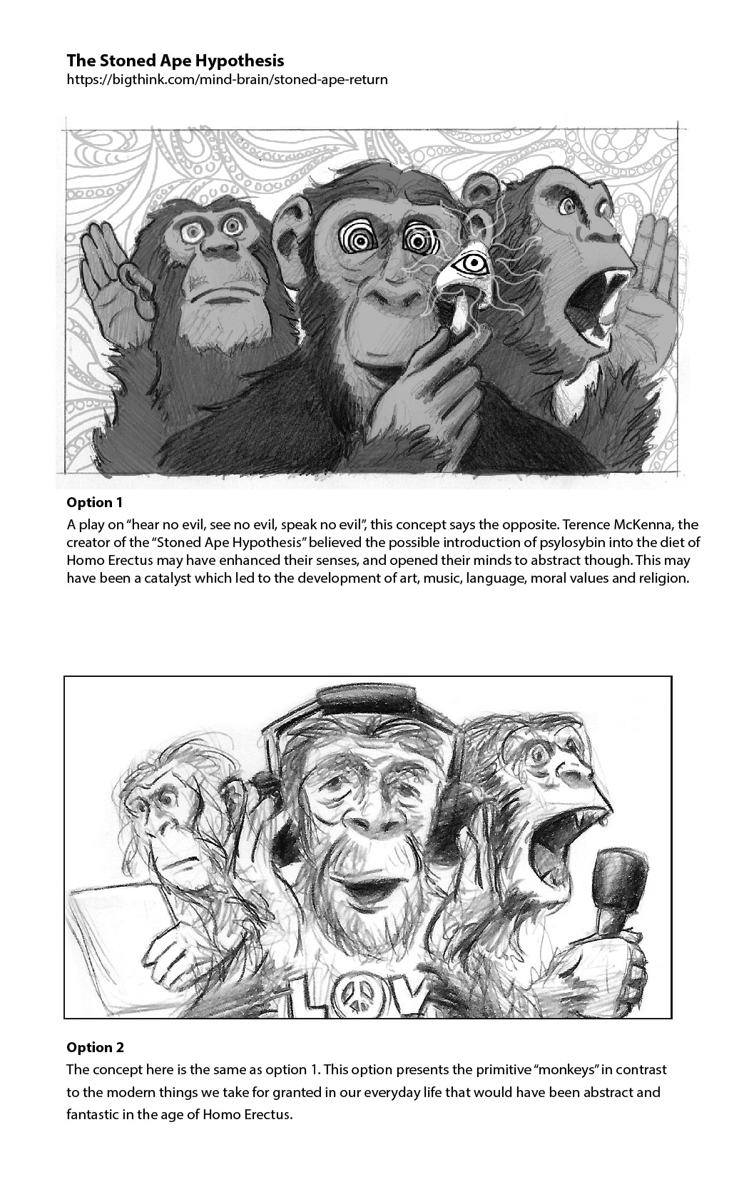
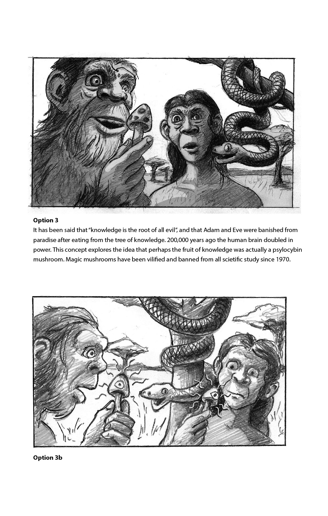
A play on “hear no evil, see no evil, speak no evil”, this illustration says the opposite. Terence McKenna, the creator of the “Stoned Ape Hypothesis” believed the possible introduction of psilocybin into the diet of Homo Erectus may have enhanced their senses, and opened their minds to abstract thought. This may have been a catalyst which led to the development of art, music, language, moral values and religion.
For this assignment, I was given one word: expanse. It was up to me to decide how to interpret that word. I had recently read an article about the Stoned Ape Hypothesis. The expanse of the human brain, and its evolution over time seemed like a perfect subject.
Below is my illustration in place of the original image that was used on the website "Big Think".
I begin with a word association list. This helps me think of the possibilities. I sometimes make connections at this point that I may not have if I had just jumped into the thumbnail process.
After this, I start the hard part, sketching out ideas. Even though this is the "anything goes" part of the project, (when you open yourself to the possibilities) it's usually the most stressful; starting with a blank piece of paper.
The ideas I like most I'll sketch out in a bit more detail. I also try to work out some of the values to help figure out the composition and lighting. An explanation of the concept is included to be sure the intention of the image is clear.


Once a direction has been determined, I gather reference to help me figure out the details of the image. For this illustration, since I was going with the Japanese maxim of the Three Wise Monkeys, I decided to go with chimp reference rather than reference of Homo Erectus. I can't just use someone else's photos of chimps, but I can look at them for details. I took pictures of myself to help figure out gesture and lighting. It wasn't a big stretch from there. ;^) I took about 117 pictures of myself, using a camera remote, trying out as many angles as I could. Here are the ones I found helpful:
Due to limited physical work space, my work these days is done digitally. I try to practice working with traditional media as much as possible though. Usually I'll do my sketching traditionally, then finish it on the computer in Photoshop using the Kyle T. Webster brushes. Below is the pencil sketch using the gathered reference to better inform the composition.
Next step is to work over the drawing in Photoshop, keeping an eye on reference for the details. Since sitting in on an online demo by Jon Foster, I have been starting my illustrations in gray scale, and then adding in the color later. It was something I hadn't thought of, but makes so much sense. If you work out your values in gray scale, they will work in color, and it's just easier!
I don't want my work to look too digital. One way to fix that is using scans of natural textures. I layer these textures over my illustration using combinations of multiply and overlay, and adjust the opacity so it's not too distracting.
A new trick I learned recently from the illustration super genius Sterling Hundley is to lay in some quick color using a gradient map layer. The color on the right of the bar is highlights, and the left is the darkest tones. You can add in colors along the bar. Where ever the colors fall along the bar, that's the percentage of the gray scale it will affect. For this illustration I used a gradient of yellow, orange, purple and a very dark blue.
After that, I used some adjustment layers to play with the color tones. I then added layers set to color or multiply to paint in specific colors, and create a more complex color scheme.
